Details On Names Excluded From WWE Draft Pools
<
>

wrestling
Ask 411 Wrestling: Who Had the Most Matches Over Wrestlemania 40 Weekend?
wrestling
Himanshu’s TNA Impact Review 4.25.24
wrestling
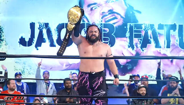
Update On Jacob Fatu Reportedly Signing With WWE, Note on Possible Debut (SPOILERS)
wrestling
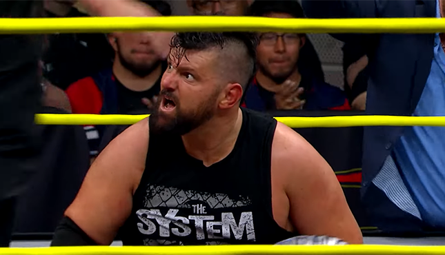
Hall’s AEW Dynamite Review 4.24.24
-
Ask 411 Wrestling: Who Had the Most Matches Over Wrestlemania 40 Weekend? Who worked the most matches over WrestleMania 40 weekend? Ryan Byers answers this and more in ...
-
Himanshu’s TNA Impact Review 4.25.24 Himanshu Doi checks in with his review of this week's TNA Impact.
-
Update On Jacob Fatu Reportedly Signing With WWE, Note on Possible Debut (SPOILERS) As previously reported, Jacob Fatu is believed to have signed a deal with WWE after ending his ...
-
Hall’s AEW Dynamite Review 4.24.24 Thomas Hall checks in with his review of this week's AEW Dynamite.

+
read more 
+
read more 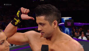
TJ Perkins Files New Trademark For ‘The Aswang’
+
read more 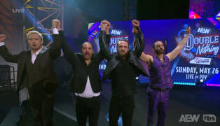
Ratings Breakdown For This Week’s Episode of AEW Dynamite
+
read more 
Sami Zayn Says He And CM Punk Have A Clean Slate, Talked Out Their Issues
+
read more 
TNA Rebellion PPV Buys Down Significantly From Hard to Kill, Note on Attendance
+
read more 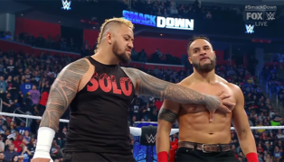
WWE Files To Trademark The Term ‘MFT’
+
read more 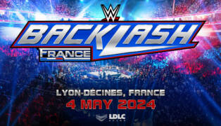
WWE Announces Details For Backlash France Store, Opens Next Week
+
read more 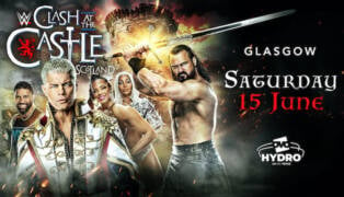
Tickets For WWE Clash at the Castle: Scotland On Sale Today
+
read more 
Early Estimated PPV Buys For AEW Dynasty Lower Than Last Two PPVs
+
read more 
Details On Injury Suffered By Dominik Mysterio, Surgery Required
+
read more 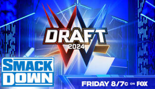
Lineup For Tonight’s WWE Smackdown: The Draft Begins
+
read more 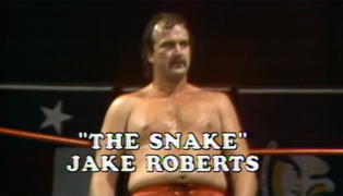
Jake Roberts Recalls People Getting Injured From DDT
+
read more 
Booker T Says Trick Williams Needed NXT Title Before a Main Roster Move
+
read more 
Leighty’s WWE Main Event Review 4.25.24
+
read more 
Boy Kills World Review
+
read more 
Ask 411 Wrestling: Who Had the Most Matches Over Wrestlemania 40 Weekend?
+
read more 
Stew's Buffy The Vampire Slayer Retrospective: Season 5 Episodes 8 - 9
+
read more 
UWF Power Pro Wrestling (6.1.1986) Review
+
read more 
The Rock Praises Gallus, Thanks Them For Helping Him Train For WrestleMania 40
+
read more 
Knockouts Title Match & More Announced For Next Week’s TNA Impact


